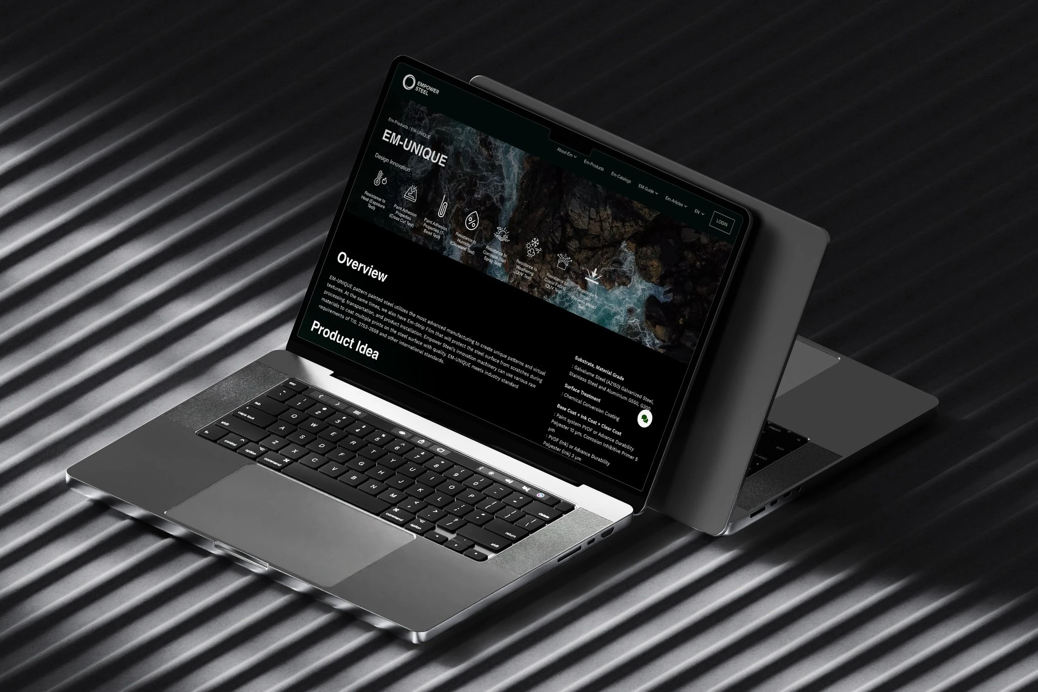
Empower Steel
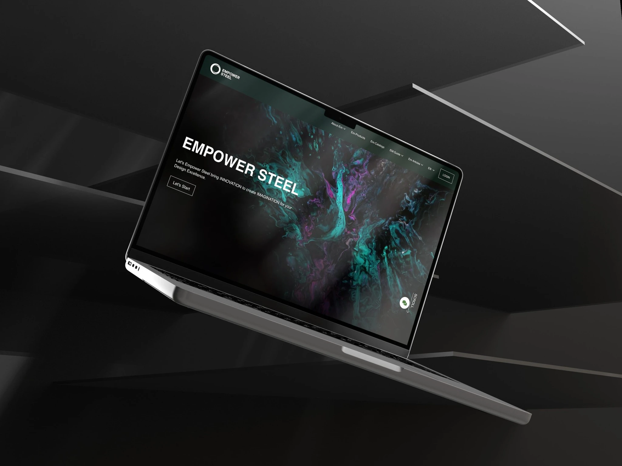
Empower sells pre-painted and patterned steel. I redesigned its website so customers could discover finishes through imagery, then get to specifications without leaving the product page.
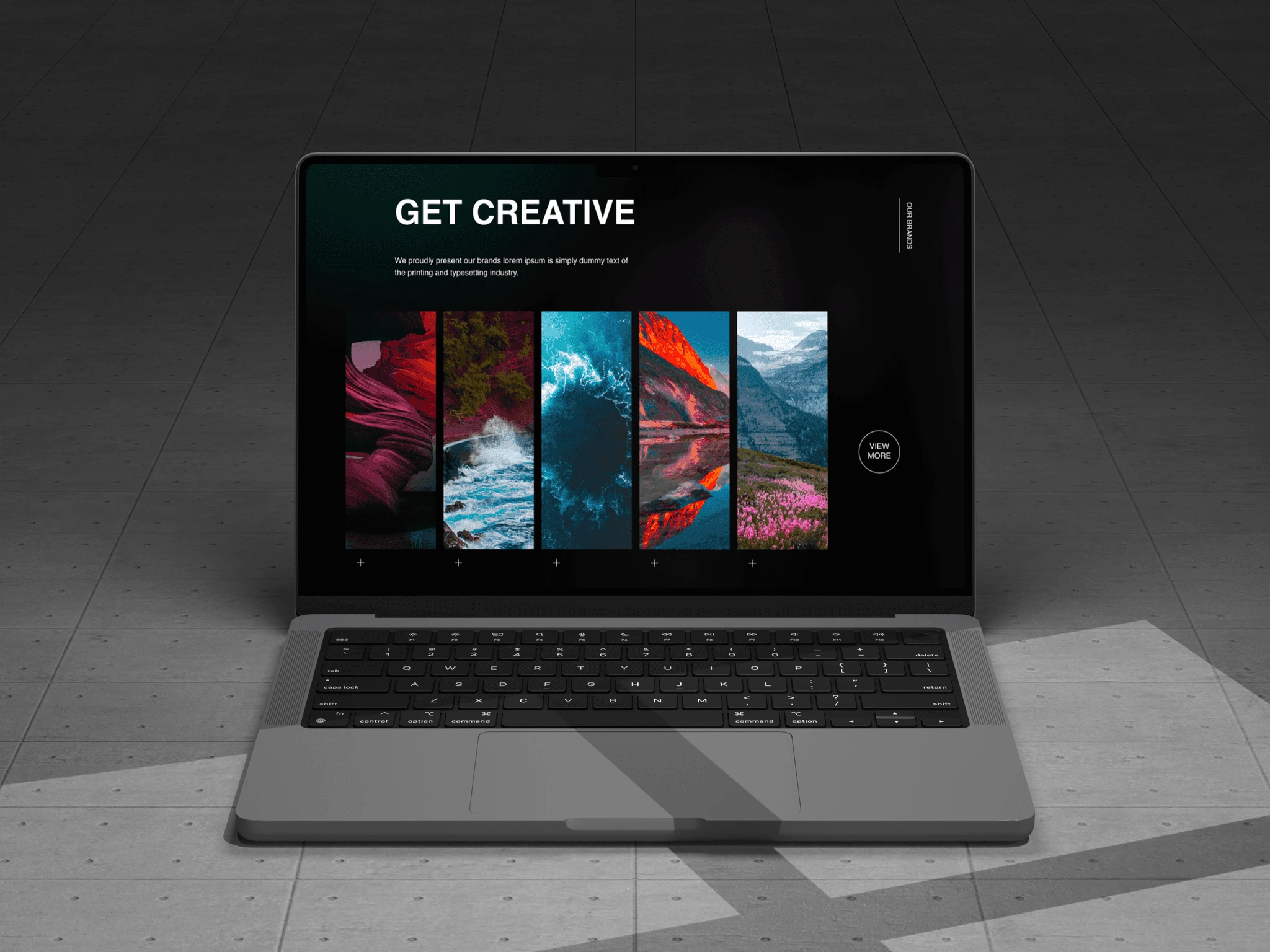
The product is visual. The buying decision is technical. The website had to serve both.
Challenge
A conventional factory website would have reduced the range to codes, tables, and downloadable sheets. That works for someone who already knows what they need, but not for architects or buyers comparing how a finish will actually look.
Outcome
I gave photography the first word and specifications the second. Products can be explored by finish and pattern, while dimensions and technical details remain close enough for a professional to make a practical comparison.
Let the material lead
Large product imagery gives color, finish, and pattern enough room to be understood before technical information enters the conversation.
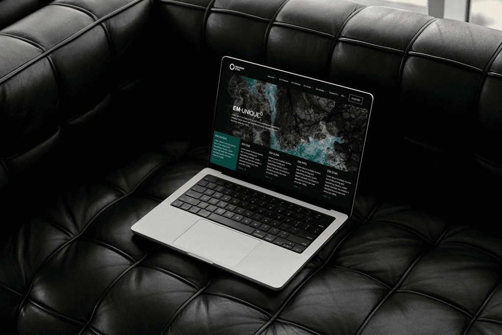
Browse steel like a collection, not a spreadsheet
The range is organized for visual comparison, helping customers narrow down finishes without digging through a long industrial catalogue.
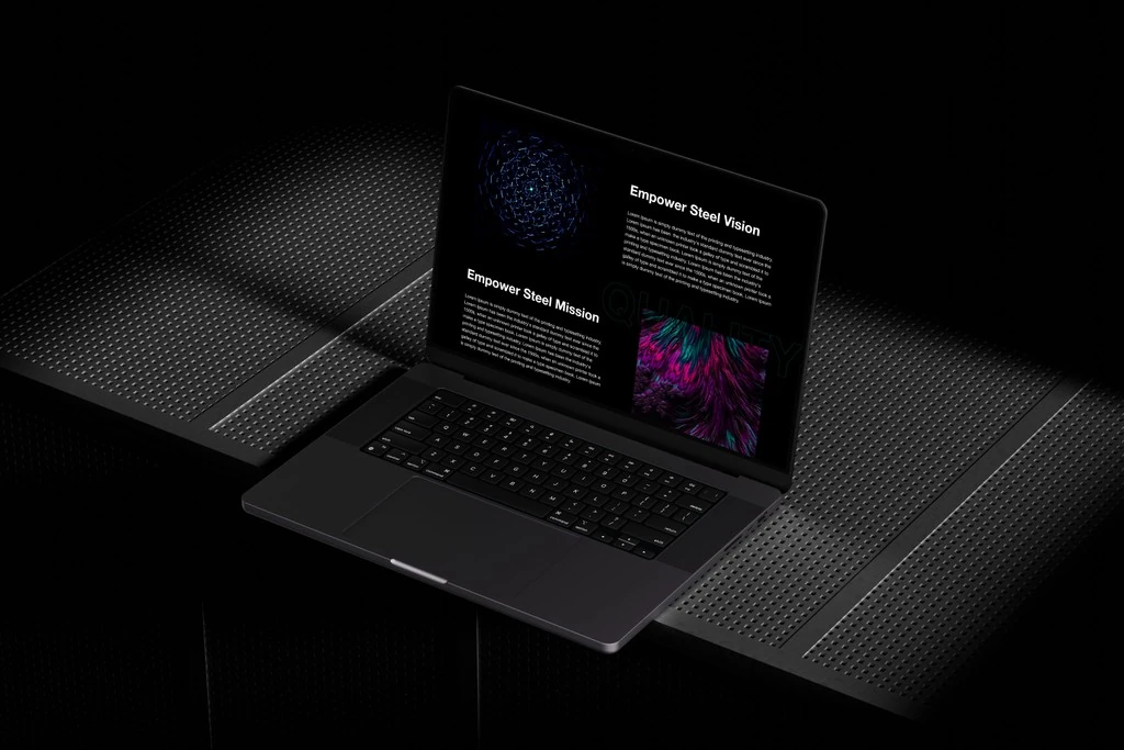
Put specifications where buyers expect them
Once a product catches someone’s eye, dimensions and technical details are close at hand. The site does not force a choice between inspiration and useful information.
Give an industrial company a recognizable point of view
The art direction uses Empower’s own products as the visual language, so the website feels distinctive without dressing the company up as something it is not.