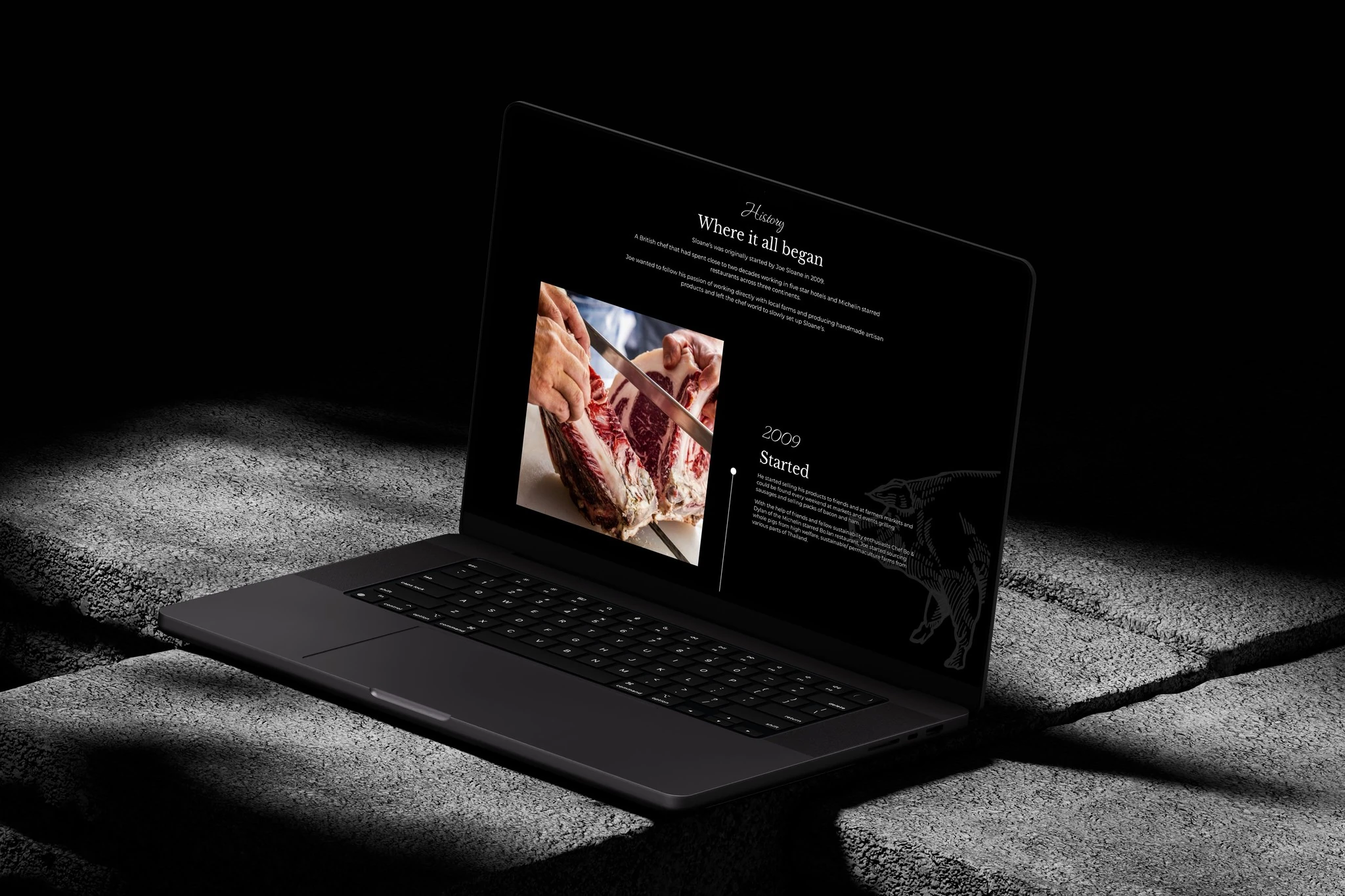
Sloane’s
Sloane’s is a premium butcher in Thailand built around high-welfare, responsibly sourced meat. I designed a website that could explain that difference and still work well for a regular grocery order.
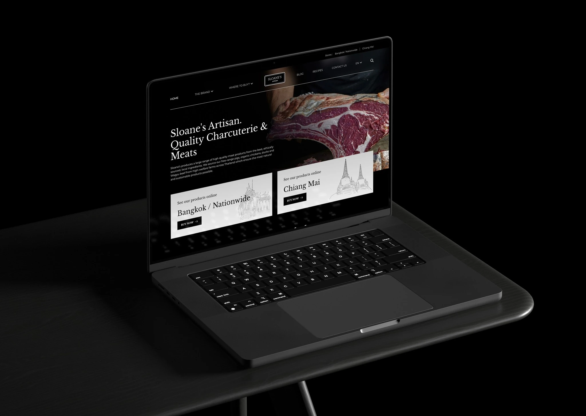
The brand story mattered, but nobody should have to read it before buying sausages.
Challenge
Sloane’s needed to show why its products cost more without turning every shop visit into a lesson on farming. New customers needed context; returning customers needed a fast route back to the products they knew.
Outcome
I kept product browsing direct and placed provenance where it could support a decision. Recipes and cooking advice give less familiar cuts a practical role, while the checkout journey stays focused on the order.
Lead with where the food comes from
Sourcing and animal welfare are part of the product story, not a paragraph hidden on the About page. They give shoppers a reason to trust the brand before comparing cuts.
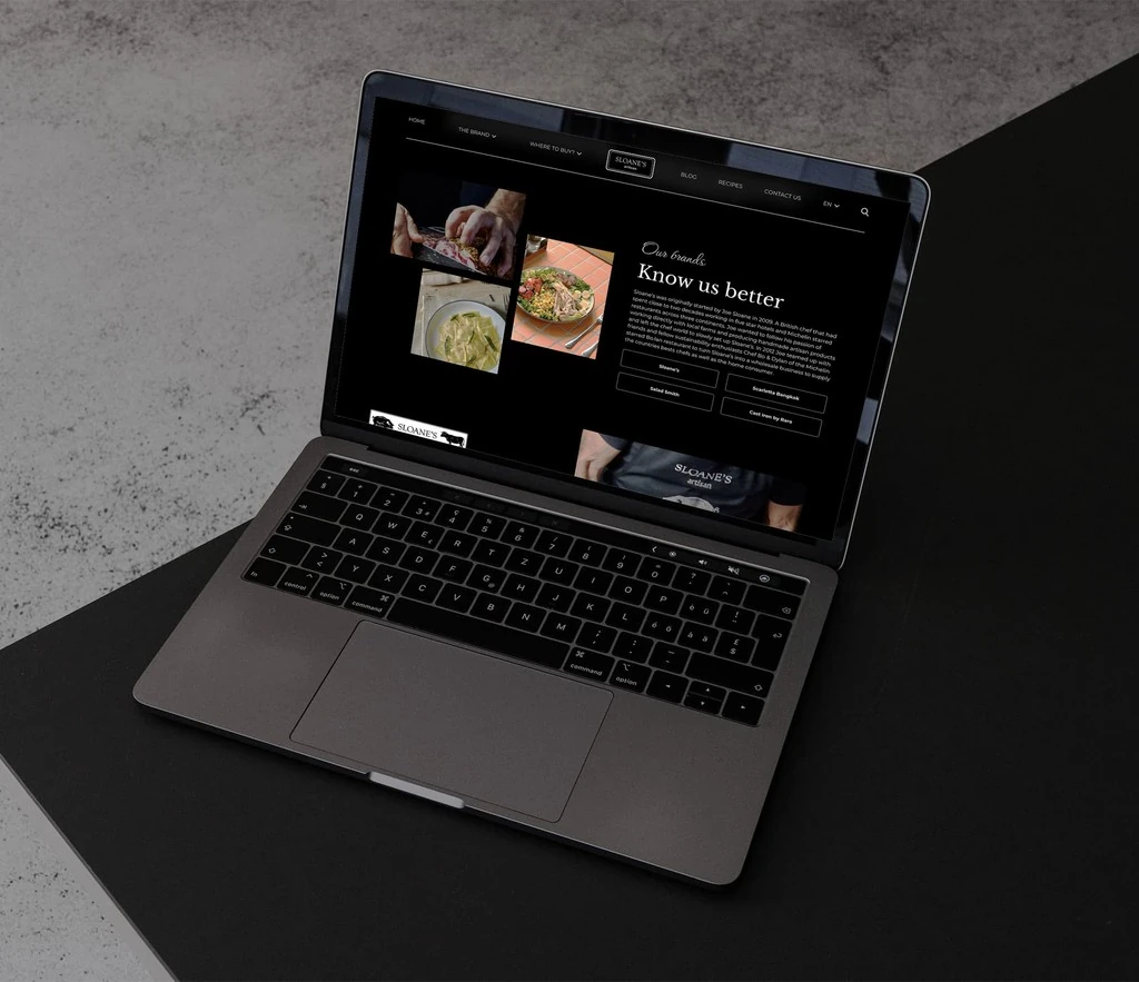
Make the catalogue feel appetizing and usable
Photography carries the appetite; clear product names, cuts, and categories carry the shopping. Neither has to compete with the other.

Help people know what to do with what they buy
Recipes and cooking advice continue the experience beyond checkout and give less familiar products a practical reason to be considered.

Keep the shop inside the brand story
Commerce pages use the same tone and visual care as the editorial content, so buying does not feel like being sent to a separate, generic store.