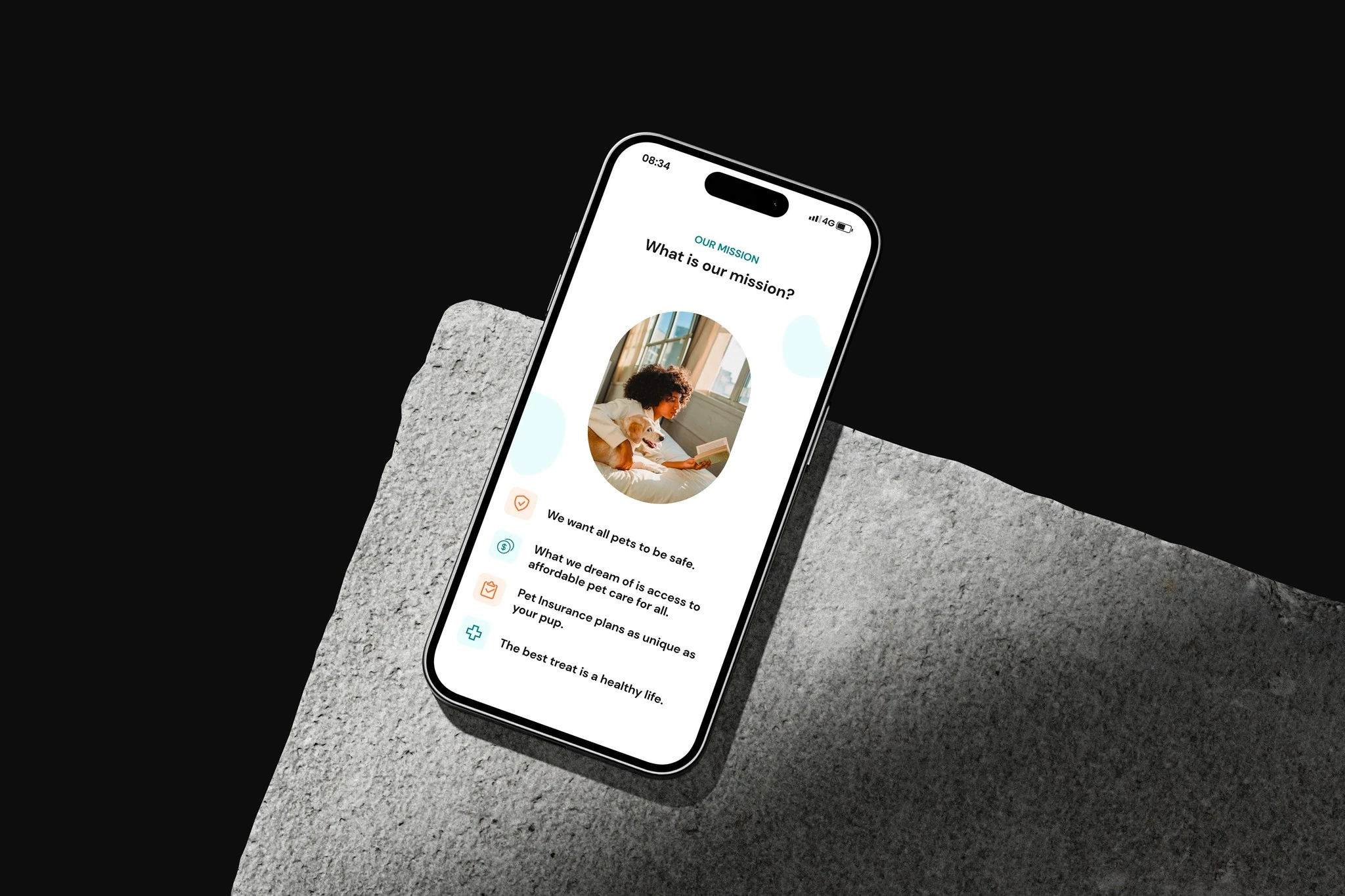
Insure Paws
I designed the launch website for Insure Paws around the questions pet owners actually ask: what is covered, what is not, how much it costs, and what happens when care is needed.
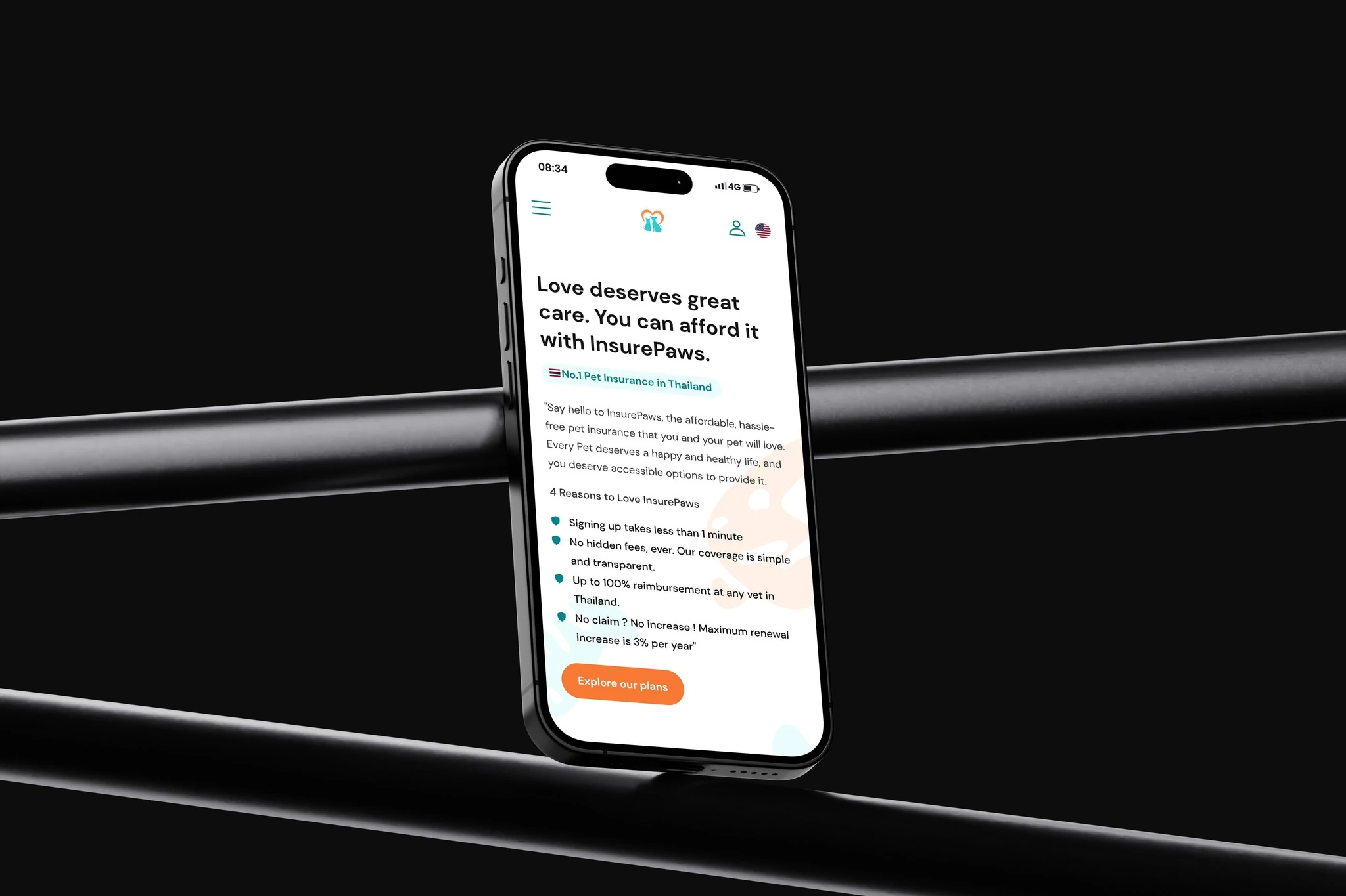
People were choosing cover for a pet they love, not shopping for a financial product.
Challenge
The brand needed to feel warm without making the policy feel lightweight. Too much insurance language would push people away; too little detail would make the offer difficult to trust.
Outcome
I put the decision into a simple sequence and wrote the interface around everyday questions. Plan differences can be compared directly, while important conditions remain visible instead of being pushed into fine print.
Start with the pet, not the policy
The first part of the journey speaks to the owner’s situation before introducing insurance terminology. It creates a more natural way into an unfamiliar product.
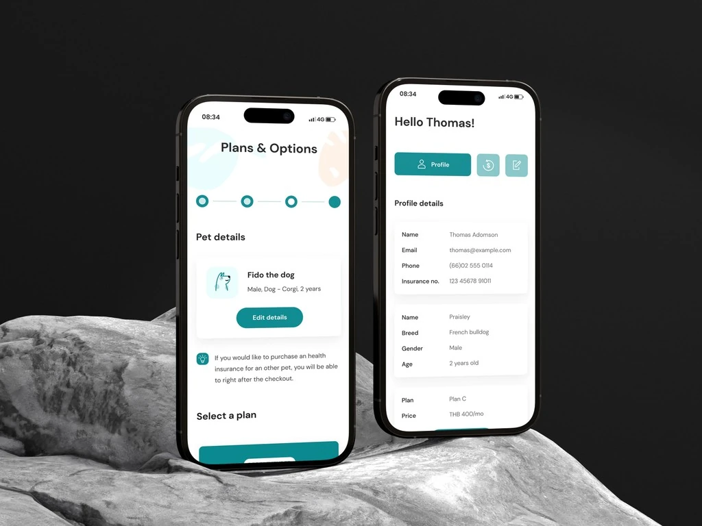
Compare plans without decoding them
Coverage and differences are written and arranged for side-by-side reading, so the choice does not depend on interpreting several blocks of fine print.
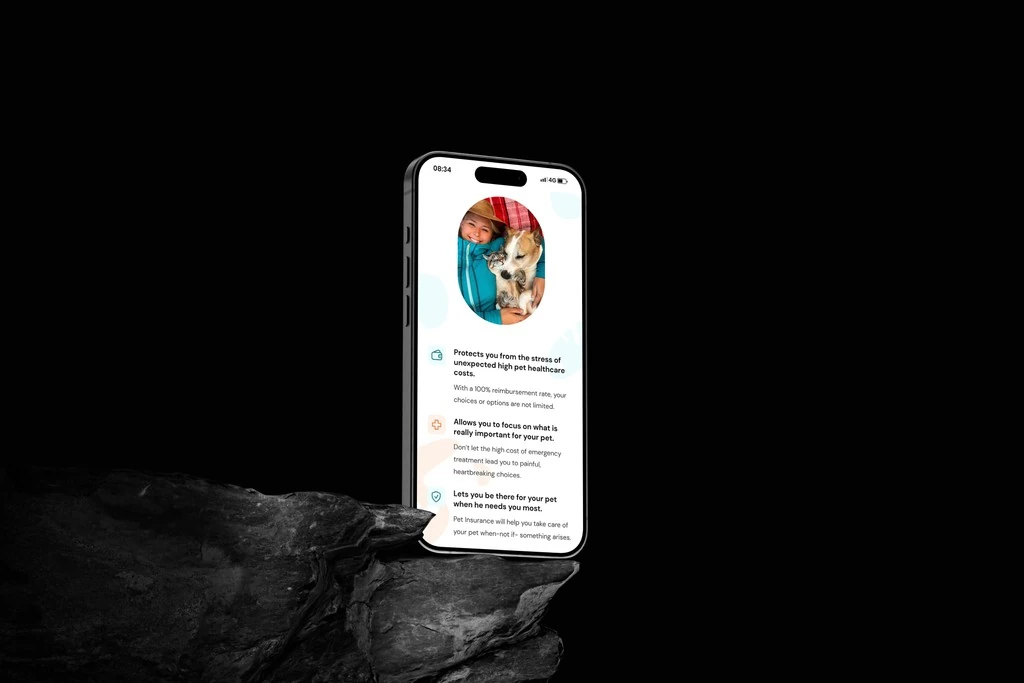
Explain the limits as clearly as the benefits
Important conditions stay visible in the main flow. Warm visuals support the tone, but they are not used to distract from what the customer is agreeing to.
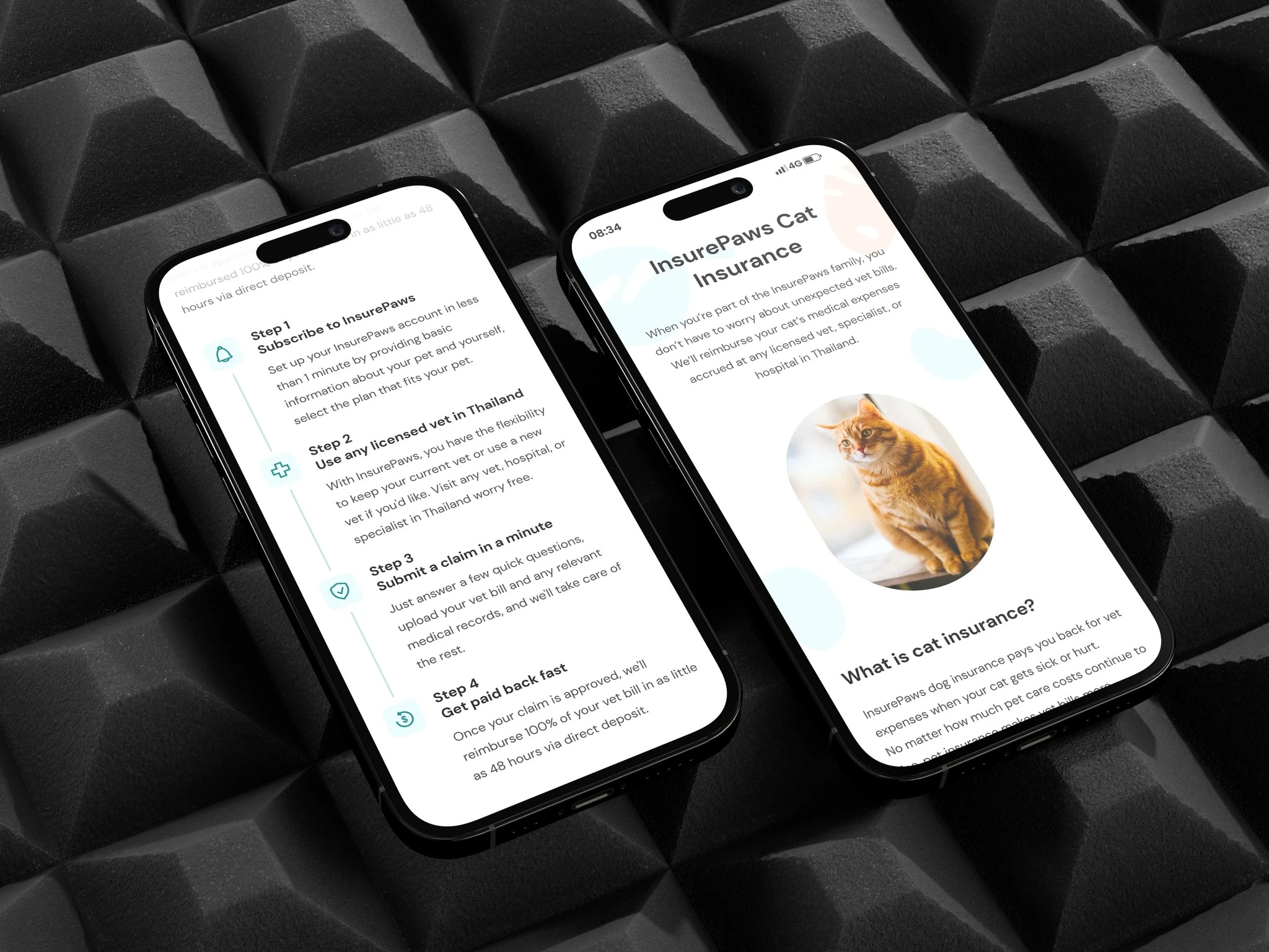
Keep reassurance practical
The final pages answer the questions that usually stop someone from continuing: what is covered, what it costs, and what happens when care is needed.